You may find that the database being shipped with OpenOffice (ver.2 and higher) delights you as much as it has me. This page tries to help you use it.
Forget anything you may have heard about Adabas, which came with Star Office, the commercial version of Open Office 1. The current Open Office's database, "Base", aka "ooBase", is unrelated. And remember that Open Office, including ooBase, is free! But don't let that fool you. And it's not new. Big organizations, government and civilian, are adopting it as their standard office suite... and saving million$, but still Getting The Job Done.
There's more about ooBase in the main index to this material.
This page is "browser friendly". Make your browser window as wide as you want it. The text will flow nicely for you. It is easier to read in a narrow window. With most browsers, pressing plus, minus or zero while the control key (ctrl) is held down will change the texts size. (Enlarge, reduce, restore to default, respectively.) (This is more fully explained, and there's another tip, at my Power Browsing page.)
Page contents © TK Boyd, Sheepdog Software ®, 11/08-7/09.
Stop press! Don't be alarmed! I started with MapChart in November 2008. Played with it, bought the full version, liked it... but didn't have much reason to use it. Nothing wrong with it... just not something I needed. Just now, July 2009, in a fit of tidiness, I tried to update my installation. And failed... at first. But the Euro Office website has a good FAQ on the issue. I was impressed by their honesty in saying "unfortunately the old version cannot even be uninstalled easily". I wouldn't, by the way, recommend the simple destructive solution. I used the "manual" option.
A new user of Map Chart would have a much happier experience... He/ she wouldn't be upgrading, would they, after all? The good people at Multiracio were very helpful, and responded to my enquiry about this very quickly. Among other things, they provided a very reasonable explanation for why things are the way they are... circumstances beyond their control. Hey! They tell us how to get things working! That "does it" for me.
This page isn't typical of the pages on my site, but the product I want to bring to your attention is, I think, way too cool!! to wait until I can write a "proper" page for you.
Now... don't get too excited.... there are some caveats I have to write up, but the above was produced in under 5 minutes by a complete novice with the EuroOffice Map Chart Pro extension for Open Office. Don't worry about the "EuroOffice" bit... I'm using an ordinary Open Office (ver 3) installation on a Windows XP (SP3) machine.
And yes, that is output from ooCalc. Sorry. Will explain another time.
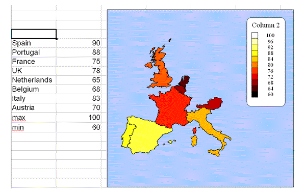
All I did, after installing the Map Chart Pro extension, was to start ooCalc, type the country names, and the figures to their right. (Made up annual average summer temperatures). I then clicked "Insert Map Chart", went through a few dialogs, making choices, and... Presto! Chart drawn for me!
Costs Euro 9.90, about $10... and it is easy to pay with PayPal, etc, regardless of what currency your account is in, so there goes that excuse.
Get it by going into OpenOffice extensions manager, "Get more extensions...", filter by "ooBase extensions", and there you are!
There's a free demo you can try... but it will only plot on a map of the whole world. Come on, people.... Euro 9.90 (about $10) is not a lot to pay!!
By the way... I have no connection with Map Chart. I just came across it, thought it fun, potential useful, and decided to tell you a bit about it.
First you set up a table with geographic data. It can be arranged either way... one row per country/ region, or one column per country/ region.
For each country (or region... assume this from now on... I'll explain in a minute), give at least one number, as in the example above.
Select the table of data. The easy way is to just drag across the relevant area.
Click "Insert | EuroOffice Map Chart". A dialog window will pop up. I won't give you all of the options, just some of the highlights...
Select the database you want to use. In the free version, the only database is "the world". With the paid version, you can select world, Europe, USA or Hungary.... but keep an open mind.... there's more to grasp, as you'll see in a moment.
A moment ago, I said "for each country..." With Map Chart, you are not restricted to working with countries. Other geographic areas... US States, continents, or different ways of chopping up the earth's surface can be used... within the limits of what Map Chart has implemented.
You also select what the data range contains. This brings to light one of the limitations of the package. If you select Europe as the database to use, then you can select cities, countries or various NUTS regions (More on them in a moment!). But note! In one map, you can have only have one of these, e.g. you can have countries, but not cities, or cities but not countries. If you choose the USA database, you can only map by states. If you choose the world database, you can map countries or continents... but not a mixture. Get the idea?
The glass is much more than half full.... but don't imagine that the extension can do everything you can imagine you might want it to!
NUTS: The European Union has set up a system of naming geographic regions, based on traditional administrative divisions of countries, e.g. counties. In French: "Nomenclature d'Unites Territoriales Statistiques". You can learn more at the Wikipedia article on the subject. The point here is that Map Chart can plot things to NUTS regions. The Map Chart help information will tell you the NUTS codes. Examples: under NUTS2, UKK4 gives you Devon, UKK2 gives you Dorset and Somerset. Under NUTS3, UKI11 gives you Western Inner London, UKI12 gives you Eastern Inner London. The NUTS system may not be familiar, but it will be very helpful to you if you want to plot data on maps... and Map Chart is NUTS capable.
So. Where were we?
We've got a table of geographic data. We've started specifying a chart.
Next we choose the region we want the map to cover. One option is "encompassing area". This is the "natural" choice... all of the regions called for by your data get displayed. The map is drawn just big enough to include them.
The other choice lets you choose continents, countries, NUTS regions, etc... the choices available change when you change the database in use.
Again, let me say the glass is half full. But if you think you can select ANY region as the whole area on the chart, e.g. by zooming and panning, as with maps.google.com, then you are making a flawed assumption!
The remaining major feature of Map Chart has not been hinted at yet.
In the sample at the top of the page, the chart is depicting single values for each of the countries. (I had in mind the average summer temperature, in Fahrenheit, but the numbers are made up.) Suppose you wanted to show not only temperatures, but, say, the value of the country's tourist trade? Well, the temperatures would be shown the same way, but you would gain a little graphic overlaid on each country.... a big bar for countries with big tourist trades, and small ones for the others, each proportional to the number in the table the chart is drawn for.
If you want to use a more interesting icon than a mere bar, that's possible. (Virtually any icon you choose to supply.)
By the way... the chart is editable and dynamic... more on this in a moment.
But first what about the following.....
France   75    20   20   60
Spain    90    30   30   40
UK       78    15   15   70
... how could that data be displayed? Again, I've made up data. The first column is again the temperature. The next two are the percents of people in the main two political parties, and the last is the percent of people in the other parties. (Again: the numbers are made up.)
EuroOffice Map Chart can handle this task! It can either draw three bars, side by side, on top of each country, or it can do a pie chart of the distribution of the population across the parties. It is easy to change the scale of the overlaid bar chart, pie chart, or scaled icon.
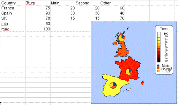
As you now know almost all of the basics, note two details in the example above. The legend has been assembled from the row of labels across the top of the table. That didn't take any work, or any "cleverness".
Also note the rows "max" and "min". There are no countries with those names, so nothing was drawn as a result of those rows.... but note that the Tture scale runs from 60 to 100... the values provided in "min" and "max".
There are still two major bits of good news to cover.
The chart is "fluid"... it can be dragged to where you want it. You can drag a corner to make it larger or smaller. If the data changes, say you change Spain's temperature figure to 95. The chart will just re-draw itself. You can even change "Spain" to "Portugal", and get a good result!
A little dose of reality, as it fits well here. You could not change "Spain" to "Madrid". This chart is of data for countries. You can do charts with data for cities... but any one chart has to be all of one or another type of geographic region. This is only reasonable, but it is an example of the sort of overly optimistic thinking which might get you in trouble.
Furthermore, if you want to make bigger changes, they are allowed too. If you right-click on the chart, you can select "Edit EuroOffice Map Chart". That drops you back into the chart specification dialogs. As an exercise, I modified the chart you see above to report cities. After I had changed France, Spain, UK to Paris, Madrid and London in the data table, I got a new, almost sensible chart.
The only "flaw" was that the cities were depicted by small icons, in the right colors for their temperatures... but hidden beneath the pie charts. If you think about it, this is no big deal... you just wouldn't set up a chart exactly as the one I describe. You might well have uses for a similar chart.
There are some more cool things you can do, options available to you... but I'm not writing more just now!
The extension isn't "perfect". What is in this world? A few things "went weird" on me.... but nothing particularly untoward happened. It was just that some things I did "broke" the chart I was trying to create. Others gave unsatisfactory results... but the worst thing I had to do was delete some stuff that had been put on my spreadsheet. It never crashed.
Remember what it costs before you get too demanding.
The examples above were done entirely with ooCalc.
In the first place, it is easy to export queries from ooBase into ooCalc tables.
Secondly, if you use (as you should!) the excellent Report Builder from Sun in your ooBase installation, then you can automate the creation of charts like the above as part of ooBase reports. Admittedly, the initial set-up of the report does look a little tedious, but you only need to do it once, and there's lots of clear help for you. Once set up, you can run it again and again. A sales manager could, for instance, get a monthly graphic reporting regional sales "at the click of a button". There's an excellent tutorial explaining how at the Map Chart website. It is well worth exploring... there's an excellent FAQ answers page, for instance.
Finally- a little word about this "EuroOffice" thing that keeps coming up. Don't worry about it! If you want to, you can buy a tweaked OpenOffice from the same people who made Map Chart. But if you don't want to, you can just use the Map Chart extension within a "normal" OpenOffice.
In its basic form, Map Chart wants you to use "Connecticut", "Ohio", etc, for the states of the USA. If you want to use the standard US postal abbreviations for the states of the USA, you can. You just set up a table of aliases. Not hard. Has other uses, too.
If you looked at this product previously, you may have been put off by comments about clashes in the installation process stemming from Python conflicts. These were due to problems in early OpenOffice things. OpenOffice version 3.x and Map Chart play nicely together, and in any case the Map Chart people gave you good instructions for dealing with the installing nuisances, while they still existed.
When you install Map Chart, the OpenOffice help file gets modified. If you click on the "Help" button of a Map Chart dialog, excellent information appears. The minor bad news is that the OpenOffice help file's index isn't, at present, populated with relevant terms.
Unless you set up an alias, "England" isn't known. Use "UK".
I encountered some problems with some of the outline drawing functions... so I just stopped using them! They aren't essential. And by the time you read this, they may have been ironed out, anyway.
If the shapes of things, e.g. countries, states, etc, seem wrong or approximate, check what you've set the map detail to. Set 100% for the best maps... which take the longest to draw.
For the "Thematic" plotting of the second column of numbers, I had to specify the location of the icon's file by hand, the "..." button didn't bring up a navigator. I also found that the program got confused what the image was if I changed a value in the grid controlling the Map Chart. But going into, then out of, the Edit Map Chart dialog sorted things out. Again... I've no doubt this will be sorted out in due course. It isn't a "deal breaker", nor does anything dreadful happen to your data or your system if this little "feature" surfaces.
I dislike 'fancy' websites with more concern for a flashy appearance than for good content. For a pretty picture, I can go to an art gallery. Of course, an attractive site WITH content deserves praise... as long as that pretty face doesn't cost download time. In any case....
I am trying to present this material in a format which makes it easy for you to USE it. There are two aspects to that: The way it is split up, and the way it is posted. See the main index to this material for more information about the way it is split up, and the way it is posted.
PLEASE >>> Click here to visit editor's Sheepdog Software (tm) freeware, shareware pages <<< PLEASE
If you liked this ooBase tutorial, see the main index for information other help from the same author.
Editor's email address. Suggestions welcomed! - - - Want a site hosted, or email? I like 1&1's services.
![]() Page tested for compliance with INDUSTRY (not MS-only) standards, using the free, publicly accessible validator at validator.w3.org
Page tested for compliance with INDUSTRY (not MS-only) standards, using the free, publicly accessible validator at validator.w3.org
. . . . . P a g e . . . E n d s . . . . .