In an earlier page, TestStyleSheet.htm, I demonstrated some simple CSS code that I find helpful in creating these pages for you.
In particular, that code gives me an easy way to put images, like this...
...on my pages.
You don't need everything that is on that earlier page! You don't need the CSS that it tells you about.
But if you avail yourself of either or both, all of this will be easier.
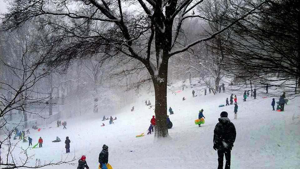
The image above should always occupy 50% of the width of the page. That's because the HTML that put it on the screen is...
<img class="tkbC"
style="width:50%;"
src="ImgsMaxMin-snow.jpg"
alt="Winter scene for showing width setting">
The "class="tkbC" bit comes from the CSS I provided you with in the other page. It takes care of centering the image. It isn't a big deal. What I want to talk about here is width, width-min and width-max. If you leave the "class="tkbC" out, these parameters will still have the described effect... the image just won't be places in the center, left and right.
Re-size the window that this page is being displayed in. Do you see that the image shrinks or grows, as necessary, to keep it taking up 50% of the width of the window? For something like this pretty winter scene, that's fine. So far, so good.
Just for comparison, here's the same image, displayed with the same HTML.. but with the 50% changed to 10%...
(It doesn't show the image well... but I hope that shows you the power in the "width" parameter?)
Consider, however, the following image...
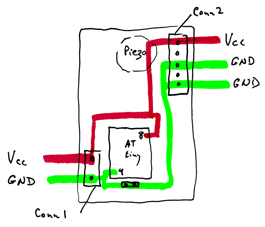
It was part of a discussion of some electronics. Currently it always takes 40% of the width of the screen. On a narrow screen, it becomes too small to be useful. On a wide screen, it becomes much too large.
Previously, we have specified widths as percents. They can also be specified in pixels. (We'll come to width-min/ width-max in a moment.)
Try changing your browser window's width again, and watch the following image as you do that. For it, the width was specified as 180px instead of 40%.
Now the image still moves, to stay centered, but its size doesn't change.
What if we make the HTML....
<img class="tkbC"
style="width:50%;min-width:300px;max-width:400px"
src="ImgsMaxMin-schem.png"
alt="Image of schematic for showing width setting">
That results in...
Perfect! It doesn't get ridiculously large, if there's space for it to do so. In "middling" sized screens, it takes 40% of the width of the screen... but if the screen isn't very wide, it takes more and more of the width of the screen, in order to stay large enough to see.
Let me recap the three "stages" the image's display goes through....
1) When the window is more narrow than the min-width specified, you will, at least with Firefox!, see only part of the image. But there will be a scroll bar to allow you to "move the page" so you can see whatever part of the image you wish to see. (You may have to look closely to see this in action... only a little part of the image gets clipped with the images, numbers we have here.)
2) As the window becomes wider, the image will "grow". (Both in width and in height.) Eventually, white space will appear either side of the image, so that it is using 50% of the screen.
3) When the image is 400 pixels wide, it will stop growing as you make the window it is in wider. The white space to left and to right of the image will become wider.
This wonderfully "fits all needs" solution is not without its quirks. My browser will not "squash" beyond a certain point. As (bad) luck would have it the browser's minimum was about where I'd set the minimum for the image (at first), and I couldn't demonstrate the "scrolling" state. If something "isn't working", play with the numbers. I think you'll find it DOES work, actually.
(Similar things are possible with images left or right justified. My CSS rules provide the images with "padding", which you won't normally see. (So, with left or right justification, if you set the image to take up 50% of the width of the screen, the image itself won't go half way across the screen. The image plus its padding will.) In-line CSS allows you to modify that to meet your wants, if the default padding doesn't suit.)
....... P a g e . . . E n d s .....